7
Lists Checklist
|
Lists are a way to break up text into more bite-size pieces by chunking information. We can use short phrases or words itemized by either ordered or unordered lists. A wall of text can be overwhelming for any learner, especially the neurodiverse and visually impaired.
The benefit of lists is to make textual information shorter and more accessible. Whether you are creating a Word document, a PowerPoint, or a page in a Canvas course, it is best to present key concepts as a list as much as possible. Busy students do not have time to read paragraphs of information on PowerPoint. Simple, short bullets get the meaning across. According to WebAIM, there are three kinds of lists including unordered lists, ordered lists, and description lists. Knowing when to apply them is helpful and setting them up properly in HTML can make a world of difference to learners who need adaptive technology to assist them.
Lists show you care
Learners can become fatigued, especially when trying to get through lots of dense material. Lists aid in comprehension and help create focal points for learners, giving them subtle clues to the most important information on the document. Want them to pay particular attention to something? Put it in a list. Are you assessing them for some information on their next test? Put it in a list. Think about the last time you went grocery shopping. Did you bring your grocery list in paragraph form? Chances are, you listed out the items by short words or phrases using dashes, bullets, or numbers. This is because it takes more time to find information within a paragraph versus a list.
When to use lists
- We want to highlight key terms
- We want to chunk the curriculum into meaningful, bite-size pieces
- We want to convey a sequence or a set of steps, processes, or procedures
- We want to create a list of links or resources for more information or a deep dive into the topic area
- We want our readers to scan the material and quickly find what they are looking for
How to apply lists
We can organize lists using numbers, letters, roman numerals, or bullets. When we create lists, we should use parallel lists, meaning that we use the same tense (e.g. all past, all present, or all future tense). Parallel lists also start with the same part of speech. In the list I just described, I listed everything by starting with the number and the word “when:”
- When we want to highlight key terms.
- When we want to chunk curriculum etc.
Parallel lists also use the same sentence structure. If you are asking a question in the first bullet, you should ask a question in all the bullets in the list. We can apply lists using the styles in our document and use the HTML editor in our preferred Learning Management System. Always select the bulleted options in your formatting ribbon as opposed to stylizing them yourself. If you do not format these lists correctly, screen readers will not be able to identify the text as a list. Be sure to use numbered lists to show steps in a process. Bulleted lists can be used to show a general list of related items without hierarchy. Another best practice is to space lists out and add some white space around the list so it doesn’t appear cluttered or overwhelming to the reader.
Version 1
Our vacation package includes three nights of accommodation, two 45-minute spa treatments of choice, breakfast in bed for two, and a bottle of wine upon arrival.
Version 2
Our vacation package includes:
- Three nights of accommodation
- Two 45-minute spa treatments of choice
- Breakfast in bed for two
- A bottle of wine upon arrival
Version 2 is the better choice. Your audience will generally not mind the extra vertical space if it means it is easier to read.
Write list items to have approximately similar line lengths.
Bulleted lists work best when they include related items. The items should share a similar level of importance. When possible, write bullet items to be approximately the same length, so that one doesn’t overpower another. Keeping a uniform shape is eye-pleasing and makes the list appear less busy.
Version 1
Do not send the following items to kindergarten:
- Rolling backpack
- Toys
- Personal items such as photos or jewelry that become lost or destroyed
Version 2
Do not send the following items to kindergarten:
- Rolling backpack
- Toys of any kind
- Valuable items
Version 1 above looks inconsistent and cluttered because of the differences in line length. Version 2 is more consistent.
Be sure not to add extra space between the bullets, however, as this will add extra code and appear as if there are multiple lists that are unrelated to each other. When you have a structured long list, try to break them down into several shorter lists with headings. Avoid using the same bullet type in nested lists. You want to visually indicate a sub-list within a major list. The main list can be black circular bullets, for example, while the nested list has open circle bullets that are indented. As you format these lists, use indentation while in the style sheet and it will naturally create nested lists that are accessible to adaptive technology. Never use cute or fancy bullet icons that aren’t included in the formatting ribbon. Always use the bullets given to you in the style sheet to avoid the screen reader trying to allocate alt text, as it could mistake these as a decorative image of some sort. For lists, always go with the choices provided in the software. Bulleted lists make it easier for screen-reader users to navigate the document.
Don’t do This (manually format a bulleted list)
- Books- Audio books
– Hardcover books
– Softcover books
– E-books
– A long sentence that wraps and takes up two lines on the page
but is not indented properly so it doesn’t read or look like a real bullet.
This is wrong because even though a sighted user can see that this content is a list, the visually impaired cannot. A screen reader will announce each item as “bullet! Dash! Dash!” If it’s not formatted by the style ribbon, it won’t be read as a list.
Do This (programmatically formatted bulleted list)
- Books
- Audiobooks
- Hardcover books
- E-Books
- A long sentence that is going to continue to the second line with the indent preserved which reinforces its position within the list
This is right because this bulleted list will be read aloud via a screen reader as a list of three items and will identify the sublists as a nested list of three items.
The design of bullets
It is important not to overwhelm learners with giant bullets. Small, discreet bullets look better than large ones. You can adjust the size of the bullets while using the styling pane. Microsoft Word, for example, allows you to create your own bullet style within the style pane so that the screen reader still picks it up correctly.
Another mistake I see is the over-reliance on center-aligned lists. Ordered or unordered lists should be left-aligned. Center-aligned lists have an odd negative shape on either side of the list. In version 2 below the left-aligned list is more aligned and easier to read.
Version 1
• Bring a number 2 pencil to the exam
• Get enough sleep the night before
• Eat a balanced breakfast
Version 2
- Bring a number 2 pencil to the exam
- Get enough sleep the night before
- Eat a balanced breakfast
Lists are great because they break text into smaller pieces and itemize content for quick reading. There are times we want to avoid lists, however. Avoid using bullets when you are trying to implement storytelling in e-learning. The flow of words and ideas wouldn’t be communicated as clearly in a list. Lists work best when there is information the learner absolutely has to know to pass the course or training (Gutierrez, n.d.).
Other reasons to use lists:
- To sum up critical information
- To present the most important information
- To break up complex information
- To give an ordered set of instructions
Make lists short
Lists with 20 bullets are hard to read. When all your slides have bullets, it can get boring and repetitive, and worst of all, your learner will not understand that these items are the most important elements to learn; when you call out a few items, they grab your attention, but when you call out 10 items, nothing stands out anymore. Make each bullet short and succinct. Use a few words, a short phrase, or one sentence maximum. According to the Decision Lab (2020), you should put the most important items at the beginning and end of the list since learners often read the beginning and end of a list first.
Consistency is key
Whatever size, font, color, and style you select for your bullets make sure they are consistent. If you use short phrases in one list, use the same approach in other lists. Consistent e-learning looks more professional and is easier to navigate. Pay attention to the spacing between lines and between groups of text and consistently apply those same spaces.
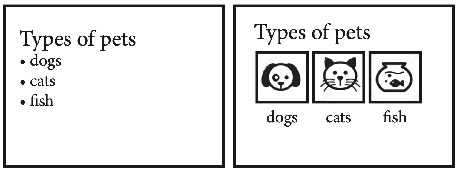
Consider eliminating bullets. If you don’t need to list something in an ordered or unordered list, consider distributing the information in a more visually appealing way. Below is one example of how to transform boring bullets into an appealing page layout. The image on the left contains only text while the image on the right has icons and an interesting layout along with the text.
For more general information on lists and accessibility search on WebAIM.org for semantic structure lists.
Suggested guided questions/projects to assess your understanding of lists:
|
