3
Alt Text Checklist
|
Alt-text is otherwise known as alternative text. Any content on your course or materials that isn’t text needs to be supplemented with a text alternative otherwise called Alt Text. According to A Practical Handbook on Accessible Graphic Design (2010), Alt Text can be converted by assistive technologies into whatever format the reader needs, including Braille or speech. Non-text content is any images, animations, video, audio, illustrations, charts, or graphs included in your course or materials. When possible, there should be an alternative provided so that all learners can access the content equally.
A common example of using alternatives is PowerPoint. In a face-to-face class, PowerPoints are accompanied by lectures. When PowerPoints are uploaded online, they are of little help. To help improve the use of PowerPoints, audio narrations can be added and a screencasting technology can be used to create a video to mimic the in-person experience. To further expand access, audio transcripts and captions can be added. If a PowerPoint is provided without additions at least the images in each slide should have Alt Text.
Alt Text needs to be added in charts, graphs, and infographics that have text that cannot be read by screen readers. This is a common problem as many infographics and the like are turned into PNG or JPG which are considered flat raster files and cannot be read. In PowerPoint, a better alternative would be to input the data using the chart tools. Using JPG, GIF and PNG file types for images are O.K. to use, but when an extended amount of text is embedded in a chart or graph either add a description that lists all the test or design with HTML editable text. Software often has an HTML editor or a way to insert screen readable data for this purpose.
Although it is done, it is not advised to use non-HTML text inside a flat raster image. A raster image is an image created with pixels vs a vector which is mathematically created. Raster image file types are .png, .jpg, .gif and vector image file types are .svg and .ai. Generally, you want to avoid images with text unless the text is HTML text, meaning that it can be read and picked up by screen readers. When text within an image can’t be read by screen readers, you should supply that text as Alt Text, especially if the text is relevant to the image. Always use your best judgment and let context be your guide, but in most cases, the text should be available for all learners to access.
Always use your discretion and context when deciding on how much text is required to communicate the necessary message in the image. Like a Twitter Tweet, the Alt Text should be short. One or two sentences are all that is needed in most cases. If you need to explain more, you can include a longer description as a link below the image. Always include the most important, concise information first. The learner then has the choice to read further or skip ahead, knowing they got the gist of what they needed.
One thing to consider when writing Alt Text is to avoid opinions and write only obvious information. It is not ethical to try to use Alt Text to persuade someone of your subjective opinion, report only on the facts.
Seductive details
Seductive details are often used in curricular materials and courses and are sometimes added to fill in white space or in the hope of making the content more interesting to look at or read. Seductive details can be any number of things such as text, animations, photos, music, or sound effects that aren’t directly helping learners obtain the objectives of a lesson. Illustrations can enhance comprehension but if they are not relevant it can lead to poor learning outcomes.
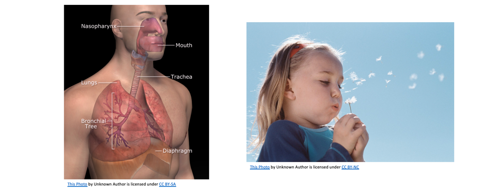
The illustration on the left contains a labeled illustration as a diagram to help learners remember the parts of the pulmonary system where the photo on the right, although eye-catching, does not aid in instruction and merely serves to draw the eye in. When selecting graphics for courses, images that help convey meaning are best because not all non-text content is needed or useful. Designers should be discreet when selecting non-text in their course because if it doesn’t aid in instruction or help the user understand the material, it is probably not necessary. Decorative elements should be marked as such so the screen reader technology ignores them. If it doesn’t have meaning, it shouldn’t have Alt Text. Adding in random clip art or a decorative wingding is considered a seductive detail and can increase the cognitive load of not only the visually impaired but all learners.
If you do not provide Alt Text for your image, the screen reader will read it as the file name of the image.

Take the image above. If you were to read the code, it may say:
petparrot-8a.jpg
That is the name of the file, but it is possible to change the Alt Text to say parrot sitting on a steering wheel instead. This gives better context to the visually impaired.
In code, it would read something like this:
<img src=”petparrot8a.jpg” alt=”parrot sitting on a steering wheel”>
Alt Text can be applied in most software and learning management systems and tutorials on how to do it are usually available online. Writing effective alt-text is more challenging to master because one must consider context and meaning. There are lots of great resources that allow you to practice writing alt-text and compare your answer with an ideal one to see how you measured up.
For some general tips on writing Alt Text, you can take a deep dive into WebAim. Overall, a good recommendation is to write with clarity in a succinct and structured way. Think about the most important elements of the image, what needs to be communicated to the learner and why.
| Tip: Remember the goal of the non-text element is to aid in instruction, not decorate the page. |
If the image helps the learner make sense of the material with a visual example, explain what that image is within the context of the material. What is the purpose of the image and what is it supposed to be communicating? Tell the learner the most important part of the image and leave out the rest. Sometimes a literal description is needed while other times it is not.
Consider the following text alternative for an image.
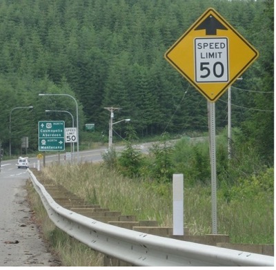
Tree-lined highway with a yellow speed limit sign indicating that up ahead the speed limit changes to 50 miles per hour.
A description like this is very detailed and considered an ideal one. If you wanted to make it more succinct, however, and you are sure that your learners are familiar with this symbol already, you could use the following Alt Text description instead.
Warning: Speed limit sign ahead
Avoid redundancy
When writing Alt Text, avoid repeating information already given. Remember if you have to say it again, perhaps you should consider omitting the non-text element. Captions and Alt Text are not the same. If you have a caption for an image, do not duplicate the Alt Text word for word. The alternative text explains information in images for screen reader users. Captions describe images to help users relate them to the surrounding text.
Words to omit
Screen readers announce when the user has come across an image. So, the best practice is to not use the words “link to” “image of” “photo of” or “picture of” in the description. The exception to this rule is if the type of media is relevant to the course. If you are designing an art course, for example, and the image is a photograph or a painting, you would want to indicate that. Always consider context; in an art course, learners need to know the medium of the image because it is relevant to the course content. In a course about gender identity, you want to include text that indicates the gender of students in a photo. Inclusive text may include terms of gender like non-binary if the context calls for it, but if describing an image of pre-school students in music class your description may just say students, children, or learners. Context matters.
Another example of how to write Alt Text with context is by analyzing the learning outcomes of the course or lesson. In the painting below the Alt Text can describe the medium, size, painter, and title, if it is placed in an art history course and the details were important to communicate. Alternatively, the Alt Text can be more succinct with title and artist for a more general context or overview.
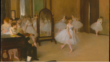
Edgar Degas, The Dancing Class, 1870, Oil on Wood, 7 3/4 X 10 5/8 In.
vs
“The Dancing Class” by Edgar Degas.
Lastly, remember to use proper punctuation and end sentences with a period so screen readers will pause between them. Alt Text is an integral part of both graphic design and digital accessibility and should be included in not only courses but any material your learners or stakeholders have access to.
Suggested guided questions/projects to assess your understanding of Alt Text:
|
