11
Alignment Checklist
|
Alignment has to do with how things line up in a grid. In any piece of visual communication, there are margins, gutters, columns, baselines, and hanglines that make up the grid. Below are some visual examples of these terms.
Margins are important to all designs. They create a bumper around your content to visually craft the space. Margins are specific to the medium. Print designers need margins for projects that are not full-bleed (artwork that extends to the edges). Print design is rigid while the screen is responsive and fluid. Digital design sizes are determined using percentages or ems/rems.
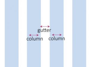
Columns are present on-screen whether you see them or not; the trick is to space content out with enough breathing room and align all objects along these invisible lines. The space between columns (the gutter) is equally as important as the columns themselves as they provide a less cluttered environment.
Hanglines and Baselines are horizontal guides used to create an edge for aligning images and text. These lines actually create the grid where content can be segmented and placed on the page. We want to keep the lines even and spaced uniformly because one little off-center object will create visual tension. Snap your objects to a grid to allow for a cleaner look and feel. A baseline grid is a consistent set of horizontal lines that are useful when designing both print and digital content. Want to know the true way to tell a novice from an expert graphic designer? When all the items on the page are center-aligned and a giant logo sits right on top, you can be sure the person that made this decision is not an expert graphic designer. This is boring. It is predictable and harder to read than left-aligned text.
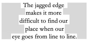
English speakers read left to right, so the jagged edges on the left and right of a center-aligned block of text frustrate us. It works for a wedding invite since there isn’t a ton of text, but we would never want to read a book set in center-aligned copy. Also, we want to avoid too many alignments on the page. We can do all left, and one item right for contrast, but we don’t want a left, a right, and a center alignment. Using too many alignments causes excessive cognitive load since the learner needs to decipher, decode, and organize items on the page. It is better to design courses with a strong alignment because using a grid helps organize information and brings clarity to the course.
When we left align, we reduce cognitive load as learners don’t have to look at those jagged edges that appear in a center-aligned block of text. The more visual tension there is, the greater the cognitive load and the harder it is to learn something. If we align to the grid, we can produce clean, crisp designs that our learners enjoy engaging with. Left alignment looks more inviting to read and more professional. We are most likely to be naturally attracted to designs with a strong alignment. Since we are bombarded with thousands of messages a day, we want to produce one that stands out from the crowd and clutter. Strong alignment can help to achieve that.
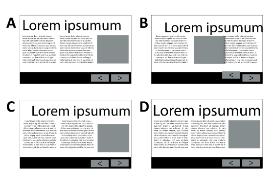
In example A, the left align text allows for a strong line on the left and a ragged line on the right, making it easier for the eye to go line to line. The image, text, headline, and forward and back buttons also have a strong alignment and align close to a grid. Option A is a strong choice. In option B, you can see that the two groups of text are aligned differently, which causes a messy look and feel. Additionally, there is overlapping text on an image which creates visual tension and too much cognitive load. In option C the text is aligned horizontally and both blocks of text are center-aligned. This creates nice repetition, but as you can see, it is harder to read center-aligned text compared to left-aligned. We would never read extended body copy that is center aligned, which is why most articles, books, and publications are left-aligned.
On a rare occasion, center alignment can look good, but that usually is in circumstances where there are short bursts of text, such as invitations, a flyer, or perhaps a simple job aid or infographic. In option D above, the two text blocks are justified, which creates a horizontal and vertical alignment. It works in this case because the font size is small enough to not cause rivers or widows and the column width is the right length in relation to the font size.
A widow is a single word alone on a line all by itself. It should be avoided because it causes visual tension. Always make sure there are at least two words on the last line in a paragraph. This is a
widow.
The giant spaces in this paragraph are called rivers.
You want to avoid those spaces because they cause visual tension as well. Rivers can occur when you force justify text and may need to be adjusted if your client insists on full justified columns. Adjusting the tracking can help.
The heading in option D expands across the left and right column as well, which creates a nice grid-like appearance. The typography chapter of this book goes into more detail on the nuances of type alignment but generally left alignment is best in e-learning.
How our eye views a page
Our eyes generally read in a Z fashion. If we don’t design our e-learning course in the z fashion, we have to use alignment to draw the viewer in and get their eyes to go directly where we want. We can even use eye-tracking software to check where viewers look on a course, webpage, or app and even in order and how long. In the article free eye-tracking software on the imotions blog, you can read about 10 eye-tracking software tools to try. The knowledge you gain from these tools can help you modify the design to guide your learners to focus on the most important content.
| Tip: I used to tell my college students that when you apply graphic design theory to your work, you can start to control people’s behavior and essentially persuade them to buy the product or service. You can make them look at what you designed, create an emotion, and then act. |
When we create connections with a brand, it’s usually one that has a great graphic design. We love falling in love with design and are instantly repelled by ugly designs. See if you can find a local newspaper and you will see what I mean. Look for an ad for a small business. Most likely it will be ugly, and you will immediately want to close the paper or at least let your eyes drift away. Ask yourself why that is. You may only have the vocabulary to talk about a couple of the concepts so far, but you can probably start to point out bad design. Chances are, the ad you are looking at in the newspaper is cluttered and doesn’t have a strong alignment. This comes from the mentality that if a client is paying for that small space, they had better fill it with as many things as they possibly can think of to tell the audience. This is a bad idea, however.
One thought/idea per page is ideal. When you clutter the page up with too many text boxes and images, learning is harder. Your audience uses their brainpower wondering where they should look first. The excess information you crammed in there is not only overwhelming but not very interesting. When learners encounter the same problems with clutter in a course, they will likely not be very interested in finishing the work, they may get distracted, and the cluttered, randomly aligned module could prohibit their learning. Strong alignment reduces cognitive load because we don’t have to think about where to look next. Bad alignment looks unprofessional, messy, and like it was thrown together without care. Do you want to convey this in your portfolio? No. You want to apply intentionality to your learning design.
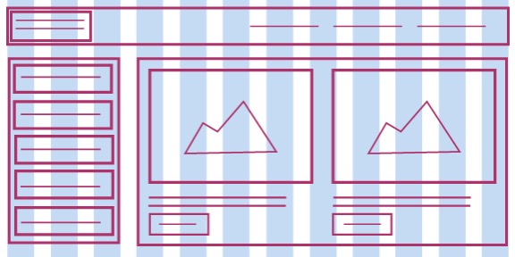
In the example to the left, you can see how a strong alignment and grid system leads to a less cluttered look and feel and allows the learner to navigate through the course more easily. If we want our learners to take our course and complete our modules, we need to have empathy for them while doing so. Think about how you would feel slogging through a training that was visually cluttered with an absence of alignment. You could forget what you learned and the entire training would leave an unfavorable impression.
More on Text Alignment Options


Alignment options can be accessed through most program style ribbons. In the image above, you can see universal icons for left-aligned, center-aligned, right-aligned, and justified text. I avoid justified unless setting text in a newspaper or magazine where the columns are narrow. Left align is my favorite and the alignment most common in the portfolios of people who have worked with Fortune 500 clients. This doesn’t mean it’s the right choice every time, but whatever alignment you choose, you want to be consistent and use the principle of repetition to do so. If one page in your module uses left alignment, the next few pages shouldn’t have text boxes thrown around randomly. Not only does it look unprofessional and messy, but it also increases cognitive load and creates a barrier to learning. The user must wade through it all to discover meaning. If you are using intentional learning design, you can mix alignments within a page to add contrast. For example, if your headline is left-aligned, your body copy, image, or photo caption is right-aligned.
Left-align is usually the way text is set in a novel, on a video game, in an app, and on a website. We read left to right and our unconscious brain prefers a strong left alignment versus a ragged one that occurs in a center alignment or a right alignment.
As with most rules in typography, you can break this rule for very short bursts of text. Titles and headers are where you can have some fun with type and play it up with alignment, color, font, and style. Shorter bursts of text mean it is easier to get through and read. But, as a reminder, be sure to make the contrast high enough so that it can be seen.
Be aware of kerning
Kerning is the space between letters. When kerning is too tight, it can make it hard to read and it is especially problematic for the neurodiverse or dyslexic learner. Kerning can be challenging to learn. There are combinations of letters that are more likely to be problematically called kerning pairs. Practice kerning these pairs and you will be an expert in kerning before you know it. According to Striver (n.d.), most fonts have between two hundred and five hundred built-in kern pairs. When I taught typography in my graphic design classes, I used a digital hands-on game called Kernme. This helped my students learn experientially and it gave them real-time feedback as they worked through a series of kerning pairs adjusting the space between letters. In the figure below the V is too far from the A and the E is too close to the V. Go to type.method.ac to try it for yourself.
Before kerning
After kerning
Most programs will allow kerning, but the way you adjust kerning depends on the software. In Adobe Illustrator, PhotoShop or InDesign, you can adjust kerning with a Mac by clicking “option left arrow” or “option right arrow” while you have your cursor between two letters. In the Kernme game, you can just drag the letters to the left or right. If you want to kern letters on a web-based program, you can use lettering.js which is a jQuery plugin that enables selectable HTML text on the web to be kerned and controlled in many ways.
Aligning Visual Assets
When aligning visual assets, the same rule applies to text alignment. Always try to align assets with other assets. You want to make sure you are lining up items on your page to make it easier for your learner to read and view them. All the assets on your page are connected by an invisible line. Even when you have elements that are far away from each other, say a header and a footer on a website, you still need to align them. I use the digital rulers in my software to align items up to the exact pixel. I have been trained by eye to see grids within my work. Even if I don’t have the digital ruler or smart guides set up, I can still align things perfectly.
| TIP: You want to zoom in to make sure your work is perfectly aligned. There are usually key commands to zoom in, even in a program that exists in a browser. I often use “command +” on a Mac and “control +” on a PC if I don’t see a magnifying glass tool or something similar. |
Most software includes smart guides, where you see visual cues on the screen when things are aligned. In addition, many software programs also include the ability to “snap to grid” which will automatically align items on an invisible line when moving objects in incremental ways. The key to appearing like an expert and not a novice is to put in the time for details. Once you have identified how these invisible lines connect everything on the page, you can see how the arrangement of those items leads to a much cleaner, polished-looking portfolio piece.
| TIP: By intentionally aligning to a grid, you are allowing learners to use their brains to focus on learning instead of trying to decipher what they are looking at. This reduces cognitive load and improves learning while capturing and retaining the attention of the learner. |
A grid makes everything look much cleaner and more organized. It is not about making things pretty, but having things make sense. We never want to throw objects at a page as if we are throwing darts and watching them land randomly. You can create all sorts of dynamic compositions using a grid that reduces cognitive load, increases the professionalism of your work, and raises the caliber of the pieces in your portfolio.
Suggested guided questions/projects to assess your understanding of alignment:
|
